↓ Skip to main content
  1. Research Portfolio/

Data Visualizations

A selection of visualizations I have created for different projects.

Lorem ipsum dolor sit amet, consectetur adipiscing elit. Vivamus non magna ex. Donec sollicitudin ut lorem quis lobortis. Nam ac ipsum libero. Sed a ex eget ipsum tincidunt venenatis quis sed nisl. Pellentesque sed urna vel odio consequat tincidunt id ut purus. Nam sollicitudin est sed dui interdum rhoncus.

A graphic I created to explore why fermentation is important for cacao production & what are the microbes doing. From a presentation I gave on [Cacao fermentation](https://istmobiome.github.io/cacao/talk.html).
A Sankey diagram I made showing the volatile compound profiles in cacao beans (green) & chocolate (brown). The pink nodes delinate shared compounds. From a presentation I gave on [Cacao fermentation](https://istmobiome.github.io/cacao/talk.html).
A graphic I created to describe the factors that influence fermentation dynamics in cacao production. Fermentation is the key step in the formation of aroma precursors in chocolate. From a presentation I gave on [Cacao fermentation](https://istmobiome.github.io/cacao/talk.html).
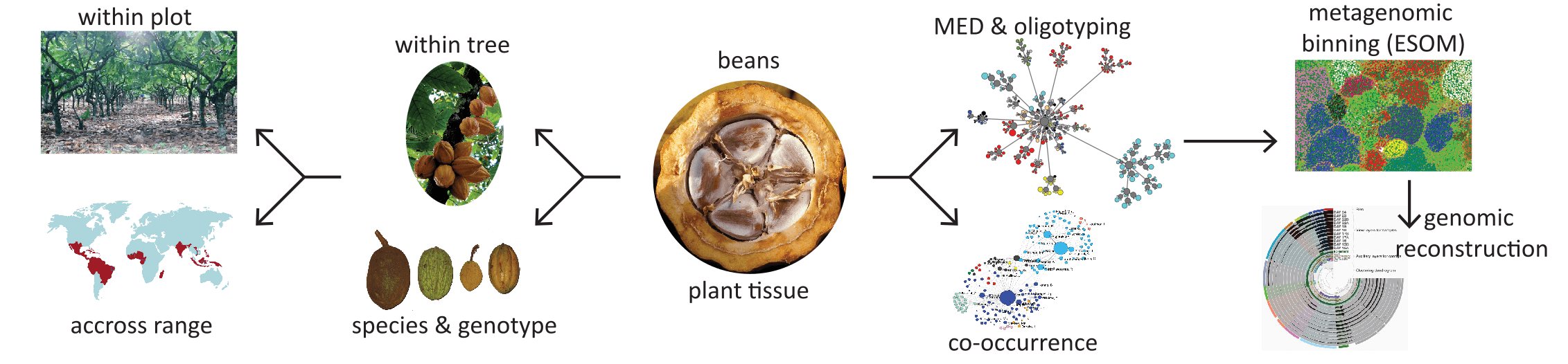
A conceptual graphic I created for a project to develop the seed endophytic microbiome of cacao as a vehicle to elucidate the relationship between tropical forest ecosystems & microorganisms. Seed endophyte microbiomes assessed across numerous ecological scales using an integrated suite of sequencing & computational methods.
A [heat tree](https://github.com/grunwaldlab/metacoder) showing taxonomic difference between normoxic (blue) vs. hypoxic (orange) water samples from a Caribbean reef. Also from [this publication](research-portfolio/publications/johnson-rapid-2021/).
Reef-associated microbial assemblages during an [acute hypoxic event](research-portfolio/publications/johnson-rapid-2021/). I combine 16S rRNA community  data (**top**) with metagenomic binning (**bottom**). Six MAGs recovered from the assembly are overlaid, including genus-level taxonomic assignments. I used [anvi'o](https://anvio.org/) to analyze the data & create the figure.
.
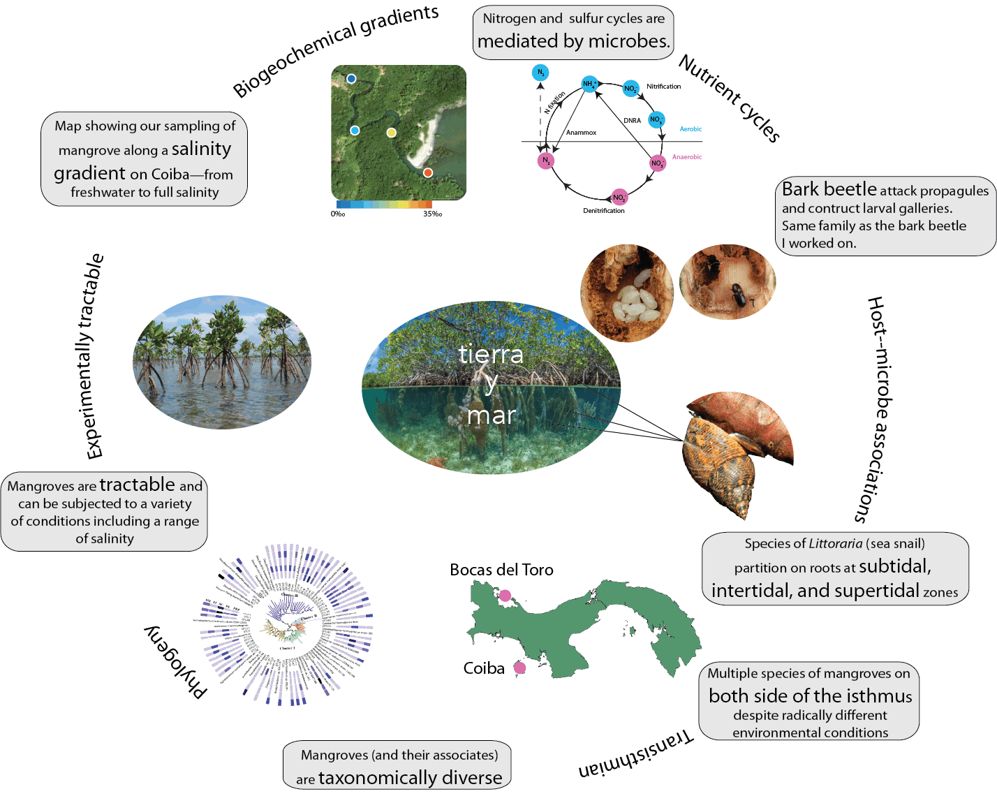
A conceptual graphic I created for a project to develop the mangrove biome as a model for investigating mosaic microbiology & nested microbiomes. Mangrove ecosystems efficiently compress a broad range of habitat variation into a compact spatial scale. In many other biomes, access to a comparable diversity of environmental factors could require hundreds or thousands of kilometers.
Results of metagenomic analysis of North Atlantic right whale gut microbes compared with publically available datasets. Word clouds represent abundance at the phylum level where each word represents a phyla & the larger the word the greater the contribution to total community diversity. The number of words represents total phylum-level diversity. From [this publication](research-portfolio/publications/sanders-baleen-2015/)
Results of microbiome analysis of North Atlantic right whales compared with publically available datasets. Word clouds represent abundance at the phylum level where each word represents a phyla & the larger the word the greater the contribution to total community diversity. The number of words represents total phylum-level diversity. Pie graphs are specifically showing the relative contribution of different classes of Bacteroidetes. From [this publication](research-portfolio/publications/sanders-baleen-2015/)
Metagenomic analysis of samples collected in Panama during the [Tara Oceans Expedition](https://www.science.org/doi/10.1126/science.1261359), color-coded by the ocean where microbes were sampled. I co-assembled, binned, & reconstructed metagenome-assembled genomes, or MAGs. This was part of a  [STRI media feature](https://stri.si.edu/story/picture-unseen). I used [anvi'o](https://anvio.org/) to analyze the data & create the figure.
The Eastern Pacific (EP) & Western Atlantic (WA) differ dramatically in their geochemical & physical properties, yet several MAGs are abundant in both oceans. I used gene-level profiles to show greater variability in MAG-01 from the EP. I then mapped variable residues onto the predicated protein structure. Changes in amino acid sequence can alter the shape of a protein, which may influence the protein’s function. [Source](https://stri.si.edu/story/picture-unseen).
Topological network map showing the decomposition of MED nodes & taxonomic distribution of all final nodes. Node size is proportional to the total number of reads contained within a node. From [this publication](research-portfolio/publications/scott-bringing-2017/). I created the image using [Gephi](https://gephi.org/).
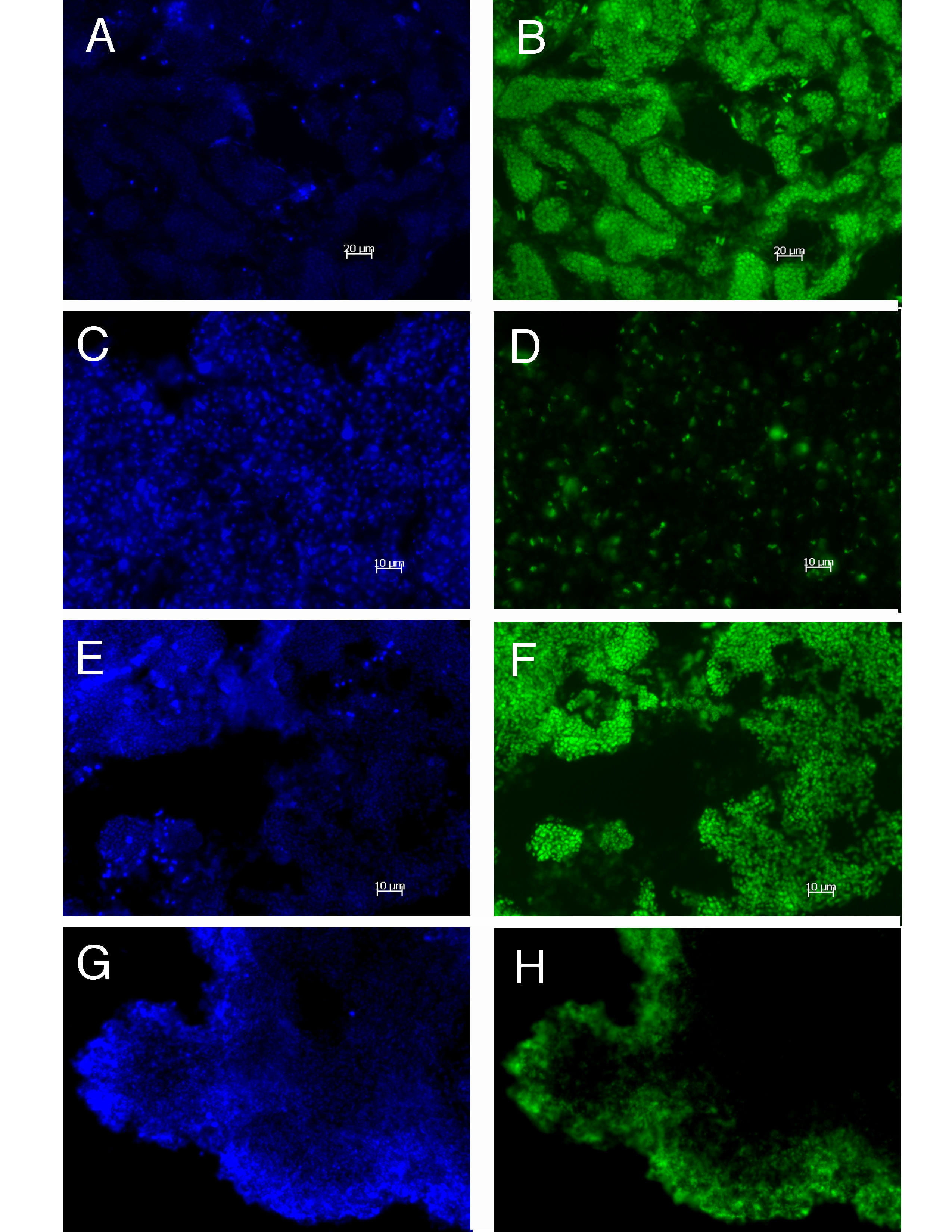
CARD-FISH analysis of bacterial consortia from pink & purple berries of Sippewissett salt marsh (Cape Cod, MA). Left panels show DAPI stain & right panels show FITC labeled image. Results demonstrated distinct spatial patterns of distribution for different taxa. From my Microbial Diverity Course student project at the MBL.
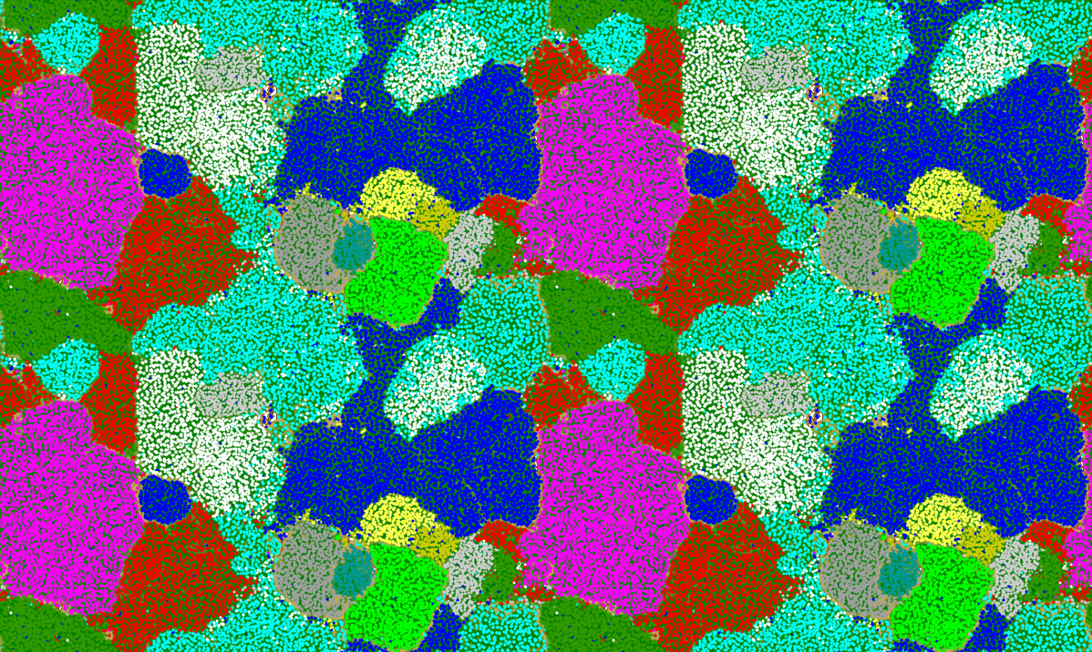
An Emergent Self-Organizing Map (ESOM) of *Zetaproteobacteria* (marine iron-oxidizing bacteria) genomes. Each color is a distinct genome. The map is toroidal, meaning the edges of the 2D grid wrap around—-top connects to bottom, & left connects to right—-forming a torus (doughnut shape). This eliminates artificial border distortions.
A novel visualization tool I created to (I believe) better understand the mappings of codons to amino acids. I call it the [Codon Map](posts/codons/).
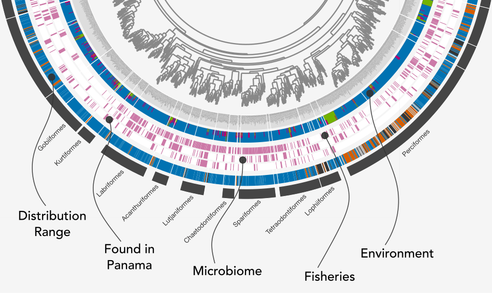
The [Betancur-R bony fish phylogeny](https://link.springer.com/article/10.1186/s12862-017-0958-3), visualized in [anvi'o](https://anvio.org/), with metadata scraped from [FishBase](https://www.fishbase.se/search.php) using [rvest](https://rvest.tidyverse.org/). I wrote a [workflow](https://istmobiome.rbind.io/project/betancur-r-fish-tree/) that decribes the process.
A closeup of the previous slide showing various metadata for each fish species.
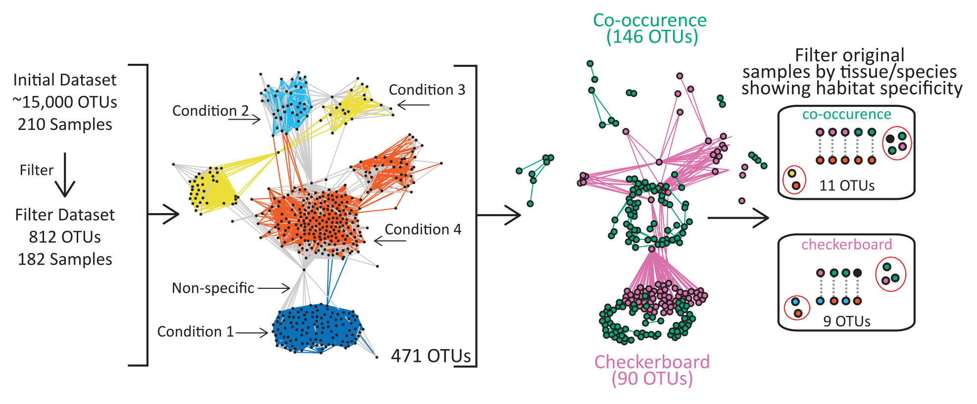
Co-occurrence network analysis of leaf-cutter ant fungus gardens & refuse dumps. Nodes represent unique OTUs & edges correspond to significant associations. Node size is proportional to abundance (natural log transformed) & node color denotes degree (number of connections). Edge color indicates habitat specificity of each interaction. I used [Cytoscape](https://cytoscape.org/) to create the networks.
Microbial diversity decline & community change under *in situ* soil warming in lowland tropical forest. Two years of soil warming (3 ºC & 8 ºC) caused significant decreases in bacterial (top) and fungal (bottom) diversity, determined by 16S rRNA and ITS sequencing, respectively. I used [anvi'o](https://anvio.org/) to analyze the data & create the figures. From [this publication](research-portfolio/publications/nottingham-microbial-2022/).
Response of microbial growth & enzyme activity to soil warming, & the relationship between this temperature response & microbial community changes. I generated the figure almost entirely in R with very little post-processing. The source code is available on [the project website](https://sweltr.github.io/high-temp/pub.html#figure-2). From [this publication](research-portfolio/publications/nottingham-microbial-2022/).
The response of soil CO~2~ efflux to *in situ* warming is greater than the increase predicted by the temperature response of microbial respiration & growth. I generated the figure almost entirely in R with very little post-processing.The source code is available on [the project website](https://sweltr.github.io/high-temp/pub.html#figure-3). From [this publication](research-portfolio/publications/nottingham-microbial-2022/).
XXXXX
XXXXX
XXXXX