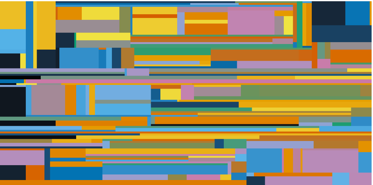
I spend a lot of time thinking about color and how I can use color to convey a message. For example, if you use too many colors in a figure you force your reader to continually go back and forth from the chart to the legend. This can be confusing and ultimately may detract from the meaning of the figure (Lipton 2007Lipton (2007). The practical guide to information design; Rolandi et al. 2011Rolandi et al. (2011). A Brief Guide to Designing Effective Figures for the Scientific Paper).
Another point to consider is that many of us have different abilities to perceive color and/or detect differences in color (Deeb 2005Deeb (2005). The molecular basis of variation in human color vision). Color blindness, also known as color vision deficiency, is the decreased ability to see color or differences in color. When designing figures, it is important to use a) a relatively small color palette and b) a palette that is friendly to a variety of people. If you want to test yourself for color blindness, search for Ishihara Test–there are many sites that offer interactive tests.
For more information on the topic, I recommend reading Bang Wong’s Nature Methods paper, Points of view: Color blindness. Wong proposes a color-blind friendly color palette that uses contrasting colors that can be distinguished by a range of people (Wong 2011Wong (2011). Points of view: Color blindness). Consider that roughly 8% of people (mostly males) are color blind. So, what do you think? Do you want Keanu Reeves to understand your figures or not? If so, consider a color scheme that is friendly to all vision types
Wong’s 8-color palette#
Wong’s scheme is conservative—there are only 8 colors. Limited color palettes like these force us to be more careful when deciding what information to target or how many groups to display.
| Preview | Color Name | HEX Code | RGB Code |
|---|---|---|---|
| Black | #000000
| rgb(0, 0, 0)
| |
| Blue | #0072B2
| rgb(0, 114, 178)
| |
| Sky Blue | #56B4E9
| rgb(0, 114, 178)
| |
| Reddish Purple | #CC79A7
| rgb(204, 121, 167)
| |
| Bluish Green | #009E73
| rgb(0, 158, 115)
| |
| Vermillion | #D55E00
| rgb(213, 94, 0)
| |
| Orange | #E69F00
| rgb(230, 159, 0)
| |
| Yellow | #F0E442
| rgb(240, 228, 66)
|
Wong’s 8-color palette (Krzywinski modified)#
In addition to an incredible talent for data visualization, Martin Krzywinski has an excellent post on designing color blind friendly palettes. This post provides an in-depth explanation of on the physics and physiology behind color blindness, plus provides code for several different palette options, including a modified version of Wong’s palette.
| Preview | Color Name | HEX Code | RGB Code |
|---|---|---|---|
| Black | #000000
| rgb(0, 0, 0)
| |
| Sapphire Blue | #2271B2
| rgb(34, 113, 178)
| |
| Cyan | #3DB7E9
| rgb(61, 183, 233)
| |
| Magenta | #F748A5
| rgb(247, 72, 165)
| |
| Sea Green/Viridian | #359B73
| rgb(53, 155, 115)
| |
| Burnt Orange | #D55E00
| rgb(213, 94, 0)
| |
| Marigold | #E69F00
| rgb(230, 159, 0)
| |
| Lemon Yellow | #F0E442
| rgb(240, 228, 66)
|
| Preview | Color Name | HEX Code | RGB Code |
|---|---|---|---|
| Black | #000000
| rgb(0, 0, 0)
| |
| Strong Magenta | #AA0DB4
| rgb(170, 13, 180)
| |
| Violet Pink | #FF54ED
| rgb(255, 84, 237)
| |
| Persian Green | #00B19F
| rgb(0, 177, 159)
| |
| Mexican Pink | #EB057A
| rgb(235, 5, 122)
| |
| ku Crimson | #F8071D
| rgb(248, 7, 29)
| |
| Tangerine | #FF8D1A
| rgb(255, 141, 26)
| |
| French Lime | #9EFF37
| rgb(158, 255, 55)
|
Krzywinski’s 12-Color Palette#
Martin Krzywinski also provides a 12 color palette that offer more options than Wong’s palette. Just be careful—-figures with too many colors can inhibit our ability to discern patterns.
| Preview | Color Name | HEX Code | RGB Code |
|---|---|---|---|
| Jazzberry Jam | #9F0162
| rgb(159, 1, 98)
| |
| Jungle Green | #009F81
| rgb(0, 159, 129)
| |
| Brilliant Rose | #FF5AAF
| rgb(255, 90, 175)
| |
| Aqua Marine | #00FCCF
| rgb(0, 252, 207)
| |
| Blue Violet | #8400CD
| rgb(132, 0, 205)
| |
| Dodger Blue | #008DF9
| rgb(0, 141, 249)
| |
| Deep Sky Blue | #00C2F9
| rgb(0, 194, 249)
| |
| Plum | #FFB2FD
| rgb(255, 178, 253)
| |
| Scarlett | #A40122
| rgb(164, 1, 34)
| |
| Imperial Red | #E20134
| rgb(226, 1, 52)
| |
| Pinkish Orange | #FF6E3A
| rgb(255, 110, 58)
| |
| Goldenrod | #FFC33B
| rgb(255, 195, 59)
|
| Preview | Color Name | HEX Code | RGB Code |
|---|---|---|---|
| Teal Green | #006A5E
| rgb(0, 106, 94)
| |
| Mexican Pink | #ED0D88
| rgb(237, 13, 136)
| |
| Turquoise | #00BDA9
| rgb(0, 189, 169)
| |
| Pale Crimson | #FFC4D4
| rgb(255, 196, 212)
| |
| Cerulean Blue | #0058CC
| rgb(0, 88, 204)
| |
| Electric Purple | #D208FB
| rgb(210, 8, 251)
| |
| Violet Pink | #FF66FD
| rgb(255, 102, 253)
| |
| Cyan | #00EFF9
| rgb(0, 239, 249)
| |
| Japanese Laurel | #156D03
| rgb(21, 109, 3)
| |
| Islamic Green | #009719
| rgb(0, 151, 25)
| |
| Vivid Malachite | #00C61B
| rgb(0, 198, 27)
| |
| Radioactive Green | #00FB1D
| rgb(0, 251, 29)
|
Krzywinski’s 15-Color Palette#
And finally again from Martin Krzywinski, a 15 color palette.
| Preview | Color Name | HEX Code | RGB Code |
|---|---|---|---|
| Mulberry | #68023F
| rgb(104, 2, 63)
| |
| Deep Sea | #008169
| rgb(0, 129, 105)
| |
| Persian Rose | #EF0096
| rgb(239, 0, 150)
| |
| Aquamarine | #00DCB5
| rgb(0, 220, 181)
| |
| Azalea | #FFCFE2
| rgb(255, 207, 226)
| |
| Royal Blue | #003C86
| rgb(0, 60, 134)
| |
| Vivid Purple | #9400E6
| rgb(148, 0, 230)
| |
| Azure | #009FFA
| rgb(0, 159, 250)
| |
| Blush Pink | #FF71FD
| rgb(255, 113, 253)
| |
| Electric Blue | #7CFFFA
| rgb(124, 255, 250)
| |
| Burnt Crimson | #6A0213
| rgb(106, 2, 19)
| |
| India Green | #008607
| rgb(0, 134, 7)
| |
| Electric Crimson | #F60239
| rgb(246, 2, 57)
| |
| Radioactive Green | #00E307
| rgb(0, 227, 7)
| |
| Bright Sun | #FFDC3D
| rgb(255, 220, 61)
|
| Preview | Color Name | HEX Code | RGB Code |
|---|---|---|---|
| Aqua Deep | #00463C
| rgb(0, 70, 60)
| |
| Magenta | #C00B6F
| rgb(192, 11, 111)
| |
| Manganese Blue | #00A090
| rgb(0, 160, 144)
| |
| Tickle Me Pink | #FF95BA
| rgb(255, 149, 186)
| |
| Brilliant Turquoise | #5FFFDE
| rgb(95, 255, 222)
| |
| Indigo | #590A87
| rgb(89, 10, 135)
| |
| Cerulean Blue | #0063E5
| rgb(0, 99, 229)
| |
| Fuchsia | #ED0DFD
| rgb(237, 13, 253)
| |
| Deep Sky Blue | #00C7F9
| rgb(0, 199, 249)
| |
| Pale Lavender | #FFD5FD
| rgb(255, 213, 253)
| |
| Bronzetone | #3D3C04
| rgb(61, 60, 4)
| |
| Fire Engine Red | #C80B2A
| rgb(200, 11, 42)
| |
| Islamic Green | #00A51C
| rgb(0, 165, 28)
| |
| Sunshade | #FFA035
| rgb(255, 160, 53)
| |
| Acid Green | #9BFF2D
| rgb(155, 255, 45)
|
References
- Deeb, S. (2005). The molecular basis of variation in human color vision. Clinical Genetics, 67(5): 369–377. https://doi.org/10.1111/j.1399-0004.2004.00343.x
- Lipton, R. (2007). The practical guide to information design.
- Rolandi, M., Cheng, K., Pérez‐Kriz, S. (2011). A Brief Guide to Designing Effective Figures for the Scientific Paper. Advanced Materials, 23(38): 4343–4346. https://doi.org/10.1002/adma.201102518
- Wong, B. (2011). Points of view: Color blindness. Nature Methods, 8(6): 441–441. https://doi.org/10.1038/nmeth.1618